
Having a good product is what will keep people invested in your business. But how do you get people interested in your service long before they ever even purchase your product? The answer falls on the uniqueness and strength of your branding, messaging, and marketing cohesiveness. These elements are what make you stand out from the competition and attract your target demographics.
How do you make your branding stand out, especially on social media where you have fractions of a second to gain interest? For this question, the answer falls on the color stories and visual imageries that are told alongside the information you use to describe your product. Color is deeply connected to emotions, and you can wield the power of color to generate interest in your business.
While we all see colors slightly differently and culturally may correlate colors with different times of the year, the energy people get from those colors is all the same. You can use this information to communicate your messages more effectively and make your brand a shining example in your field.
Read on to learn about the power of color. How does color ensure that your business’s story is effectively communicated to your customers? And how can it help generate interest in your business and help boost the effectiveness of marketing?
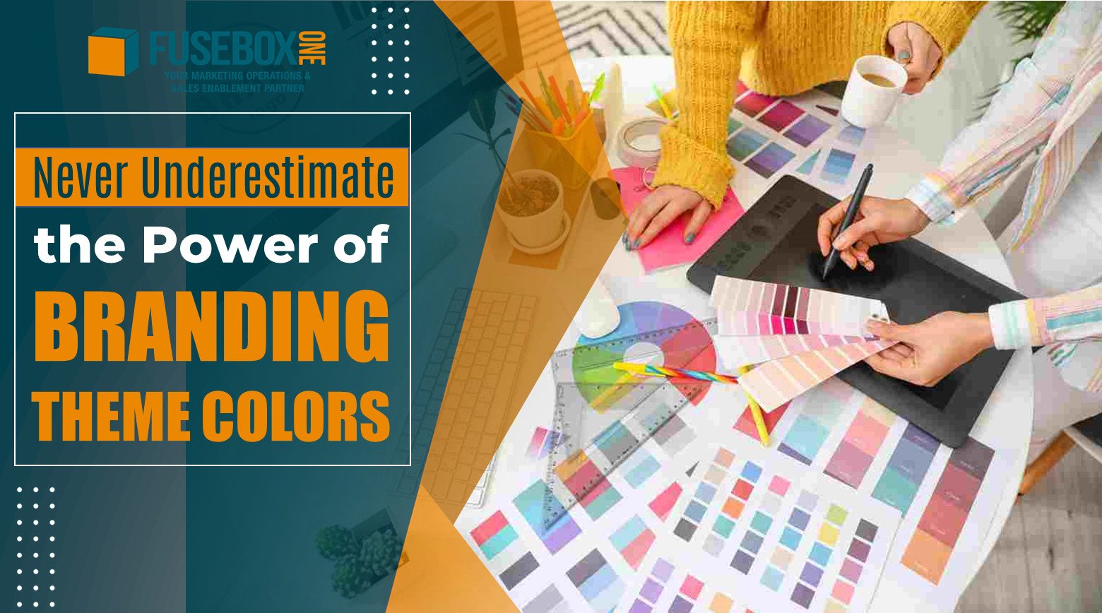
How To Pick the Best Colors
If you’ve been looking to rebrand your business or are trying to get started on a new branding tactic, there are a few tricks you can use to build a strong color story for your business. These can help convey your business’s unique values to your clients alongside your logo and quality product photos. Here’s what to know about how you can pick the best colors that can relay your interest.
Keep it Simple
To start creating your unique brand identity, it doesn’t have to be a complex process. Start at an access point that applies directly to your life. Do you or a loved one have a strong passion for a particular color or color combination? Is green a color that has always defined you? Is white the main color of your product? Pick a starting point that is easy for you to attach to and grow from there.
Do Some Research
Now, it’s very challenging to fundamentally change your brand identity once your company has established and built a history and reputation surrounding particular branding and colors. Even if you’re in the process of overhauling your current branding, you don’t want to repeat this procedure often. That means you want to pick colors that will be both trendy and lasting. This can be done by choosing colors that you’re passionate about but using them in a way that is interesting to modern consumers.
Find out what colors you’re personally attracted to and are currently popular. Head to websites that build their business on attractive images, mood boards, and crisp, easy to look at pictures. These can help you understand current trends and how you can capitalize on them. When you’re choosing colors and color combinations, consult your brand guide to ensure that they deliver a message that supports your brand rather than fight against it.
For example, if you have a company that sells personal protection gear pick powerful hot colors. A calming blue and green-based color pallet for your business won’t evoke the right feelings. You’d want louder colors that tell the customers that your product will be effective at attacking or protecting people. Colors like black, red, orange, and even white would suit that product better.
You can also do research to see what your competition is using. Is there a single color that is consistently used across the board? Do most companies use grey tones, yellow, or blue? It might be a good idea to use one of these colors to send the message that you belong to this industry. However, you also want to stand out. Use this ‘industry standard’ as a secondary or tertiary color instead of the primary one.
There are only so many colors in the rainbow, even once you tessellate those colors into the infinite options available with digital coloring tools. Likely, you will have to use colors that are also used by your competition, but how you use those colors can make you stand out.
Choose Powerful and Thoughtful Colors
As mentioned in the intro, colors have power. They have associations that you can capitalize on if you’re trying to relay distinct messages to a specific market. Generally, though, these colors can help your business feel a certain way. But what are common color associations that are basically universal?
Let’s explore feelings behind basic colors that you’d find in any crayon box.
- Red: Red is the color of vitality and passion. It is often used on warning signs and to indicate strong negative feelings like anger or rage. This is because red carries a punch that grabs people’s attention. It’s not all negative though, as red is about thoughts and items of power. Powerful things that can be conjured by red include feelings like love, confidence, will, enthusiasm, and the ability to assert oneself.
- Orange: Don’t overlook the power of orange, though sometimes this option can be cast aside. Orange is a color of high joy, brightness, happiness, and comfort. Orange is warm but not as intense as red. It pulls forward feelings of perseverance and endurance instead of active emotions. The darker the shade of orange, the more red attributes you add to your messaging. The lighter the shade, the more aspects of yellow you invoke.
- Yellow: There is a bold happiness to yellow that is clear when you see a bright flower in a green field. This image speaks to the attainment of wealth and joy. This is a creative color that is associated with abundance and has been shown to help boost memory. That’s why yellow highlighters are used! However, be sure to use yellow carefully. An overabundance of yellow in a pallet can be too sharp or bright, and pale shades may even make customers think of illness.
- Green: The cooler green tones are found at a balance point in the rainbow. The energy of green is very calming, but not as calm as blue, as green represents the vibrancy of life. It’s more active than blue, as it speaks to growth, blooming health, and regeneration. This energy helps people feel less stressed, reducing anxiety and helping relieve depression while getting in touch with the core worth of self.
- Blue: This is the most tranquil color in the rainbow. Blue embodies serenity, divine peace, relaxation, healing, and knowledge. At its most powerful, blue helps facilitate clear communication with yourself and others and induces feelings of tranquility. Because it’s not as active of a color as green, it can be cool and distant. Some shades of blue may also invoke feelings of depression, stagnation, or even boredom.
- Violet: There is much power in violet, as it is a very subtle color that exists on the edge of human vision. While red is considered the most impactful color, violet has the highest energy in terms of wavelength. It invigorates the imagination and lends feelings of mystery where it is used well. It’s been long associated with status, luxury, and royalty. Violet can also be a very heavy and overwhelming presence that may create flat images.
- Pink: Beauty is often represented by the color pink, along with soft emotions that are associated with sensitivity, delicacy, and young love. As a derivative of red, pink has its own power as well. The color pink doesn’t cower behind these sensitive emotions but embodies them proudly and without reservation. However, when used in abundance, it can be an overly sweet color that represents shallowness.
- Black: Transformation often takes place during the dark nights of the soul, or so it is said. Darkness offers protection that allows people to be their vulnerable selves and become something new. Black is a color of protection and encourages people to seek alternative information. On the other hand, the color black can also be associated with trickery.
- White: While the context in which white is used to represent purity is different across cultures, it is always a color of newness. It symbolizes washing away the old to create a clean slate. White is an inspirational color that invokes the feelings of looking towards the future, cleansing the past, and being a higher version of yourself. Be wary; white can be a very sterile color that is easily looked over when it’s used in a primary position.
- Brown: Earthy colors like brown are very grounding. They can be used to draw in the eye and call back to the base of all life—the soil. Brown is a protective color that brings concepts like family, home, and comfort. Often brown is used alongside green to create feelings of organic freshness. This is another color that can become overly heavy, especially when used in unflattering color combinations.
These colors also fall under two ‘warmth’ categories called cool and warm colors.
- The cool colors are green, blue, and purple. Whites and grays are also cool colors. These can be distant; however, they also communicate intelligence, balance, health, and harmony. That’s why many technology companies use blue in their branding because it conveys feelings of expertise and ease of use. Healthcare companies also use these same cool colors for similar reasons.
- Warm colors include red, orange, yellow and extend to pink, brown, and black. These are dynamic colors. They speak to attainment, excitement, and powerful active emotions. These warm colors remind people of the passion for living, are great for nutritional companies, and can carry highly optimistic messages to violent ones.
Choose a Pallet
One color is a good place to start; however, you want to have a pleasing combination of colors that you can use. These will make your brand look more interesting. This is not a secret in the graphic design world—everyone uses this rule to make up a branding color pallet that isn’t too busy. It’s called the 60-30-10 rule.
Basically, you use the primary, secondary, and tertiary colors in 60%, 30%, and 10% densities. This makes for a unified color theme that creates just enough visual interest to be powerful without being overly busy. Images that are too busy are difficult for the human mind to process. Overly complex images or color combinations make it harder for you to deliver clear information to customers about products and services.
Use colors on the opposite sides of the spectrum, called complementary colors, to create bold designs that make each color stand out. Or use many shades of a single color to create a unified look. If you use any monochromatic color scheme, but especially with white, attempt to use contrasting color “textures” to create visual interest. For example, the modern Apple logo is white and silvery, not just one flat shade. Always provide interest that catches customer attention.
The Benefits of Choosing the Right Colors
It’s not just about look—though that is important—it’s about exuding a certain kind of feeling that makes your business stand out. Making the right statement on all your platforms, from your website, branding, social media, and product design, is vital to crafting the best impression. This makes you more memorable than you would be with a bland or standardized look.
That brings us to the first benefits of choosing the right colors for your business:
Brand Differentiation
As has been discussed thoroughly here, color has energy and power. This also means it can capture and hold user interest. That’s why color TV and movies so quickly overtook black and white images. Color makes a much higher impact on the user than simple black and white. Though intricate patterns can make black and white highly effective in brand design.
Some studies show that saturated colors capture attention far more effectively than words. So, pick the right colors and get the attention you want. That will make you stand out from your competitors as a company with a unique vision that speaks to your target demographics effectively.
Appropriate Customer Emotional Responses
Colors come with emotions that can help get your customers invested in your product or service instantly. They influence people’s moods and can help you lead your customer to believe certain things about your product, service, and company. Color can help you prime customers with the right emotions. That way, you can build lasting relationships that will keep them coming back to your company to support you again and again.
Ease of Communication and Information Delivery
Looking at the stages of human growth and development, humans first learn to recognize patterns and colors, then later learn how to understand words and complex images. Even as adults, it is easier to process colors and images before words. Some research has even found that the effective use of color in information material increases comprehension by almost 75%. That implies that the correct colors will help people understand the information you provide better. Plus, people like to spend more time with visually engaging content that uses color well to create a unified understandable message.
Get Your Colors Translated Perfectly
When you have a strong color story that fuels your branding that you’ve worked carefully to craft, you want your printed materials to match that quality. Inadequate printing quality can reflect poorly on your business or not deliver the kind of message you were hoping to deliver.
For example, say you’re in the self-help business. You want to send a message that you have a new masterclass available to your customers. You want the printed material you send out to be just the right color of green. Too bright or too dull, and you won’t transfer the feeling of serenity and growth that you want your program to embody. Whatever product or service you deal in, you want the right colors to come across in any printed marketing material you make. From the brightest blues and warm yellows, each color should be well saturated and on quality printing materials.
Facilitating marketing and sales enablement programs is the driving focus of FuseBox One services. This includes providing companies with on-demand printing solutions. From large and small print runs, you can be sure that the quality of your printed materials is always top-notch.
All the Tools Offered by FuseBox One
Through a combination of processes, FuseBox One can offer high-quality service for all kinds of printing projects.
This is done by employing G-7 certified printing technologies that work on all-size printing projects. This allows FuseBox to print with intelligent color matching that ensures printed materials always look crisp and professional. While you’re at it, you can get all the finishing touches you need to be done on your printing projects with FuseBox as well. That includes lamination service, binding, die-cutting, booklet creation, perforation, and so many other finishing services you might need.
Many Formats Driven by Data
While many claim digital marketing tactics are outpacing direct mail marketing in terms of effectiveness, this doesn’t eliminate the power of a letter. Sending physical marketing materials is still a powerful way of getting messages to consumers. Working with the FuseBox One portal means that you get mass-produced and personalized mailing materials. These can be used alongside inkjet addressing and paper sealing that secures delivery. With the list acquisition-built mailing lists (that are PII, PHI, and PCI security compliant) that can be catered to focus on consumer or business addresses for easy direct mailing.
You can also get a wide variety of formats, including large and wide format mailings. These will always have crisp prints with true colors that are always brand compliant. With the right listing tools, you can even make specific marketing materials that are shipped to different demographics for better engagement rates.
Track Your Projects and Ensure Your Information is Safe
When you’re employing a direct mailing marketing plan, you want to keep an eye on your project’s progress. That way, you can see when materials are delivered and how effective your mailing materials have been. This is easy to track when you use the project management system that can help you organizes and manage all your marketing, including mailing materials. Plus, with secure HIPPA-compliant facilities, you know all your data is taken care of as well as your printing needs are.
Ensure Your Branding Remains Strong Through Digital and Traditional Mediums
Bright, warm, cool, dark, or seasonal colors can all be used by your business to better convey your company’s message to your customers. If you want to direct your marketing materials more effectively to key demographics, then color should be the foundation of your marketing plans.
Using color theory can make your company stand out from the competition. Then consumers can instantly recognize material from your company at just a glance. Working with the right company can help you develop this brand and help you consistently use your company colors in all your marketing materials. Should you need to create printed materials, FuseBox One guarantees high-quality printed materials in numerous forms. These include, but are not limited to, postcards, laminated papers, floor graphics, posters, amongst other printed materials you may need.
Get a Company that Does More
FuseBox One offers more than printing services, however. It can even create unique banded marketing tools you can use to make your in-house team feel more like a unit. Or, they can be used in give-a-ways or as the merchandise that customers can choose to buy to support your business. This can include merchandisable materials like t-shirts, mugs, notebooks, and other promotional products.
With other marketing enablement services offered by FuseBox One, these services can work in harmony to become your one-stop-shop that holds all your marketing needs. If you’d like to explore how these services can work for your business, get in contact with one of FuseBox One’s experts. Schedule a demo and see if these marketing solutions are right for you.

Sources:
https://impulsecreative.com/blog/5-tips-for-picking-your-brand-or-logo-colors
https://www.columnfivemedia.com/how-color-boosts-your-branded-content/
https://www.columnfivemedia.com/how-to-create-a-brand-identity/
https://www.marypomerantzadvertising.com/blog/good-visual-design-stand-out-from-crowd
https://www.renderforest.com/blog/what-is-branding-the-importance-of-branding